

Some ideas are easier to show than to explain. A mood board can capture the feel of a room in seconds. A personalized wallpaper can combine a name, a favorite color, and a certain mood without needing much explanation at all. That is one reason AI image tools have become interesting beyond the usual “generate an image from a prompt” use case.
The more practical tools are often the ones that start with something you already have: a product photo, a portrait, a background, a name, or a specific visual idea. Instead of replacing the creative process, they can remove some of the more technical steps that used to slow it down.
Start with images you already have
Combining separate photos is a good example.
Suppose you have a clean photo of a product and another image showing the kind of setting where you want it to appear. Doing this manually can involve cutting out the subject, matching its scale, correcting perspective, adjusting color and lighting, adding shadows, and cleaning up the edges. None of those jobs is especially unusual, but together they can turn a simple concept into a fairly involved editing session.
Pixlio lets users combine multiple images through several guided workflows, including product placement, subject-and-background combinations, and more creative blends. You can also give additional instructions describing how the source images should relate to each other.
That matters because “combine these two pictures” is often too vague. One image may be the main subject, while another only provides the environment, lighting reference, or supporting detail. Giving the tool that context can make the result feel more intentional.
There are plenty of everyday uses for this. A small shop might test how a product looks in a different setting before arranging a real photo shoot. A creator could build a rough thumbnail concept from existing assets. Someone planning a room, poster, or social post might simply want to see whether two visual ideas work together.
The result still deserves a close look. Fine text, logos, faces, hands, and small repeated details can be altered during AI editing. For anything that needs exact brand or identity consistency, it is better to treat the first output as a draft rather than a finished asset.
Personalization works better when it has a reason
A different kind of visual task is turning words into design.
Names have always appeared on cards, nursery prints, invitations, keepsakes, and phone backgrounds. Flowers work especially well with this kind of personalization because people already associate them with particular moods and occasions. Roses, daisies, lavender, wildflowers, and pastel arrangements all suggest something slightly different.
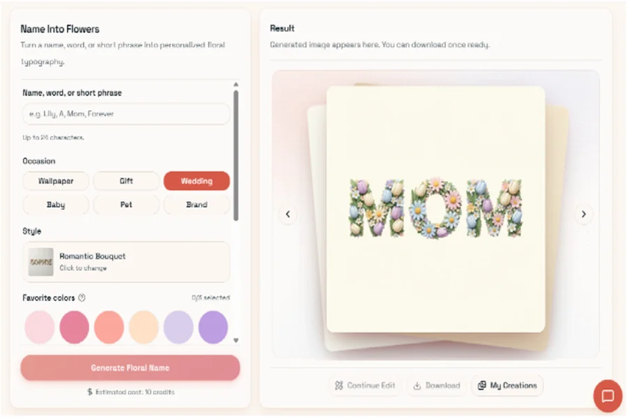
Pixlio’s name into flowers tool takes a name or short phrase and turns it into floral typography. It offers controls for the occasion, style, colors, flower choice, density, readability, and aspect ratio.
Those options are more practical than they first appear. A highly decorative result may look impressive at full size but become unreadable on a phone screen. Increasing readability or reducing flower density can make a better design for a lock screen or social post. A wedding name may call for a very different balance from a child’s name or a birthday message.
Choosing the aspect ratio early also helps. Tall compositions suit phones and story formats, while square images are easier to reuse in feeds or printed cards. It is a small decision, but it can save you from cropping away the part of the design that made the image work in the first place.
Good inputs matter more than complicated prompts
One habit worth avoiding is overthinking the prompt.
There is a lot of advice online about writing elaborate, highly detailed instructions for AI tools. That can help in some situations, but for image editing, clear source material and a specific goal often matter more.
If you are merging photos, decide which image should dominate and what role the others should play. If you are making floral lettering, think about the person, occasion, and mood before choosing colors or flowers. “Soft and calm” is a more useful direction than adding ten decorative adjectives that all mean roughly the same thing.
In practice, this feels closer to giving a short creative brief than writing a technical command. You define the purpose and the visual priorities; the software handles much of the mechanical work.
Treat the first result as a starting point
AI image tools are fast, but speed does not remove the need for judgment.
A composition may be correct while the mood feels wrong. A flower arrangement might look too crowded. A subject may blend into a background too smoothly and lose some of its character. These are not necessarily failures. They are usually signs that one or two choices need adjusting.
The best workflow is often simple: generate a version, inspect it, change one thing, and try again. Avoid rewriting everything at once unless the first result is completely off track.
For people who do not spend much time in Photoshop or other design software, that is where tools like Pixlio can be most helpful. They make experimentation easier without requiring you to learn every technical editing step first.
Images have always been another way of communicating an idea. AI has not changed that. It has simply made some of the practical work between the idea and the finished visual much easier.